Further work
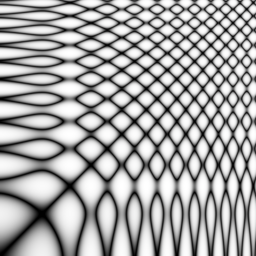
Soft reccurence plot of the function $\sin(\frac{1}{10}x^2) + sin(\frac{1}{10}x), x\in[0,25]$.
Table of contents:
What remains?
Parameter tuning and small changes
Labeler
Studying the first results from the training process, there seems to be minor differences in how the network learns for the different company datasets. The labeler might be partly to blame for this. While tuning the labeler, a very small range of companies was tested. This means that the threshold values, sliding median window, smoothing factor and maybe even the label criteria might need some rework. A good labeler should be dynamic and robust, but verifying this is a lengthy process and was therefore not prioritized for the first test runs 1.
Normalization
Optimization of the normalization process has not yet been done. This process involves testing multiple normalization routines and studying their result. This will become especially important in the future as the next section presents. Another important step is to tune the parameters for each feature that is normalized. As of today, these parameters are held constant over all the features, but their variance differ by large margin, so perhaps a more thorough look at the normalization parameters is beneficial.
Feature representations
The features present in the raw data where not treated much before normalization except for the fact that both the data for high and low where recast into representing differences from the mean price during the period (see: Preprocessing: Normalization). There are however multiple ways of expressing stock price data. One way, which might even have proven useful for the normalization process is to instead list the stock prices as percentage increases. This is in itself a normalization procedure, and whether or not this new representation would need another layer of normalization on top could be investigated further.
New Ideas
As of today, the neural network does no predictive classification in the sense that is neither tries to label very recent data, or predict any future data. This was mainly done in order to guarantee some results because interpreting the different results is an important aspect of building the network.
Now that this has been done, it is finally time to look at ways to perhaps do some sort of prediction on the data.
2D Convolutional Neural Network using recurrence plots
The networks that have been constructed have all been 1D neural networks in the sense that they all rely on time series data where each feature is an exclusive and explicit function of time. Since the data is multivariate in the sense that each datapoint contains many features, there are ways to transform this data into the two dimensional space. One promising way to do this is to use recurrence plots. Research suggests that this way of representing fincancial data could be promising.
Clustering
In order to convert the time-series data to images of the equal resolution, successive data points with the same label are clustered together. Trimming all the clusters of size greater than CLUSTER_SIZE down to this value around their midpoint and discarding the rest, leaves clusters of equal size with the same label for all data points within.
Recurrence plots
For the 2D convolutional neural network, recurrence plots where created from the equally partitioned clusters of data. The idea is to have the network find patterns in the different regions which can be generalized during training. Visually inspecting the recurrence plots generated in this process seem to indicate that the data resembles the characteristics of brownian motion. This is expected, but not appreciated.
There are two datasets created from the recurrence plots:
- Hard recurrence: This is the normal recurrence plot. Phase space distances below the nth percentile are shown as black pixels in the images. The rest are white.
- Soft recurrence: This is a proposed modification to the normal recurrence plots. Phase space distances below the nth percentile are shown as black pixels, while values over the nth percentile are exponentially mapped to values in the range [0, 1] where 0 is a white pixel and 1 is a black pixel. This incorporates more information into the recurrence plot, but the significance of it has yet to be tested. The exponential factor of scaling $\alpha$ is referred to as $\texttt{REC_ALPHA}$.
Below are examples of how these plots differ. The dataset used is 125 hours (500 datapoints) of AAPL stock, year 2018:
Since the recurrence plots use a distance metric to define points that are in close proximity in phase space, the normalization procedure that is applied to the data becomes important. For example, the feature volume has a large variance. This would cause a distance between two data points with a high differnce in volume to not be considered close, even though the volume data between the two points are as close as they can get in the dataset. Properly normalizing the data to a common codomain is therefore important, but how transformation is done is perhaps even more important. Sadly, there is no way of telling which normalization procedure is better before the network starts producing any results, so this could be considered furhter further work.
-
I should clarify what is meant by “first test runs”. These runs refer to the series of runs we performed before finalizing the university project. The project itself is by no means finished yet (I hope). ↩